“Why doesn’t my print look like it did on my screen?”
It’s one of the most common questions we hear from businesses receiving printed materials for the first time when going from screen to print. You’ve approved the design on screen, the colours look great, the layout is clean – then the box arrives and something is clearly wrong. The colours are flat, the image looks wooly or the whole thing just feels wrong compared to what you were expecting.
It’s a frustrating experience, particularly for a business investing in print for the first time when budgets might be tight. A failed print run is costly and time-consuming to fix. Once ink is on paper, it’s permanent. The good news is that most of these problems are entirely avoidable if you understand why they happen.
1. RGB vs CMYK
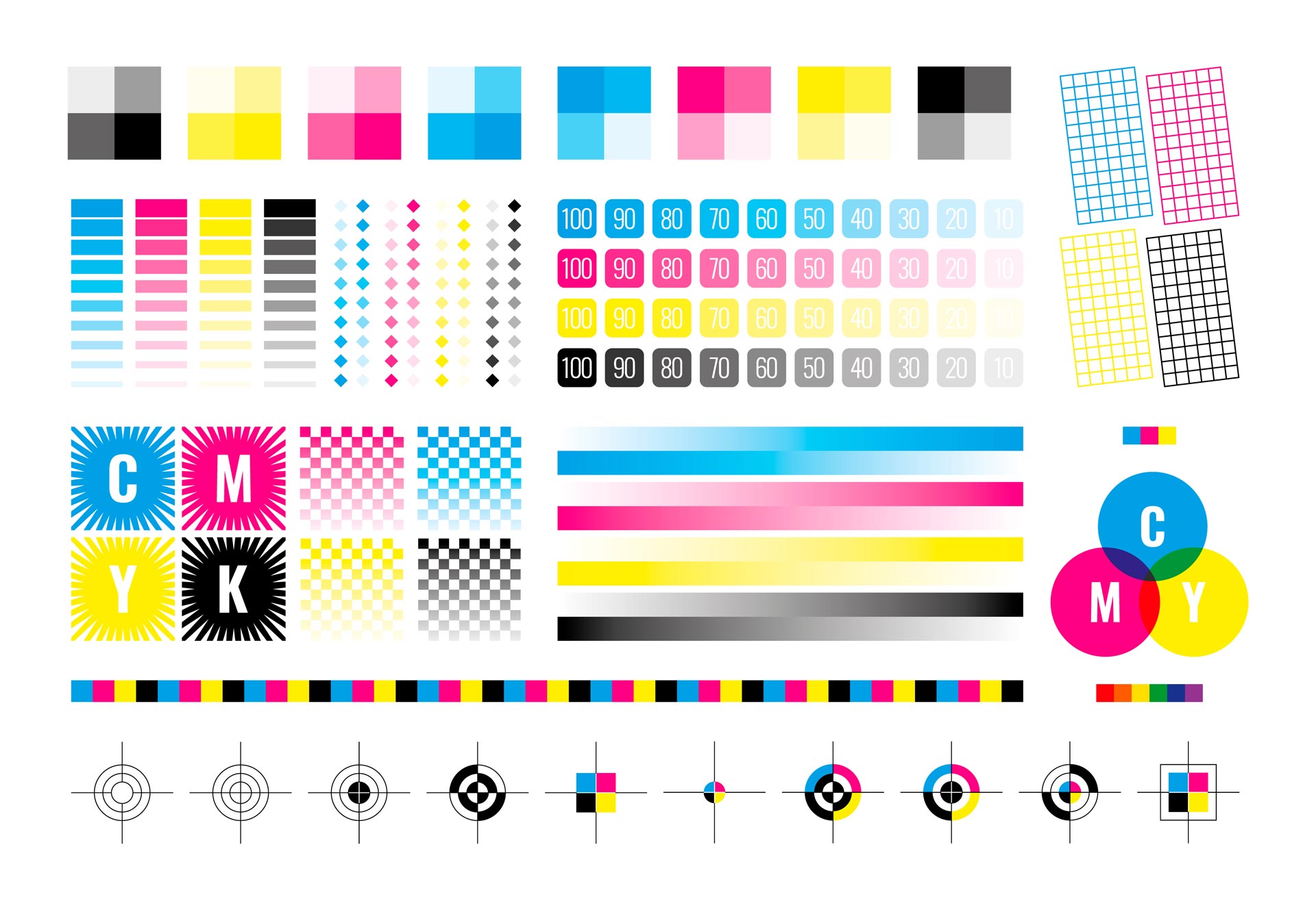
Your monitor builds colour using light – combining red, green and blue (RGB) to produce a wide, vivid range of colours. Print works completely differently. Commercial printers use a four-colour ink process known as CMYK – cyan, magenta, yellow and black. The k is for ‘key’ which is an historic lithographic printing term but black will suffice today! The range of colours achievable in CMYK print is narrower than what your screen can display. This means that bright, saturated colours that look fantastic on screen – electric blues, vivid greens and hot pinks – often print significantly duller because the CMYK equivalent simply can’t match the luminosity of a backlit display.
For businesses where colour accuracy is critical such as brand guidelines specifying an exact shade of colour – spot colours and Pantone numbers the answer. Pantone is a standardised colour matching system used by designers, printers and manufacturers worldwide. Each colour has a unique reference number, which means a Pantone 485 red will print identically whether it’s produced in a print shop in Hull or a factory in Shanghai. Unlike CMYK, which builds colour by layering four inks together, a Pantone or spot colour is a single pre-mixed ink applied in one pass. This produces a much more consistent, accurate result and is particularly important for logos and brand elements where colour consistency across different print runs and materials matters.
The trade-off is cost – spot colour printing is more expensive than standard CMYK because each additional ink requires a separate pass through the press and requires additional setup. For most everyday print jobs CMYK is perfectly adequate, but for brand-critical work where consistency is non-negotiable, Pantone may be worth the investment.
If your brand colours haven’t been defined in CMYK or as Pantone values from the outset, you’re at risk of an unpleasant surprise every time you go to print.
2. Screen settings and brightness
No two monitors display colour identically. Brightness, contrast and colour temperature settings vary from screen to screen, and most people adjust these settings to personal preference rather than any calibrated standard. What looks perfect on your laptop may look completely different on your designer’s monitor – and neither will look exactly like the printed result.
Printed paper reflects light rather than emitting it, which means it will always appear flatter and less saturated than a backlit screen. Accounting for this difference is part of the job of an experienced designer and it’s why professional colour proofing exists.
3. File colour settings
The files you send to a printer should always be set up in CMYK with separate Pantone colours if specified. Sending an RGB file to a printer forces their software to convert the colours automatically and that conversion is rarely kind to your brand colours. The result is typically a noticeably duller output that bears little resemblance to what you approved on screen.
Always confirm with your designer that artwork is supplied in the correct colour mode before it goes to print.
4. File types and resolution
PDFs are the standard format for print-ready artwork for good reason – they preserve colour profiles, embed fonts and maintain layout integrity regardless of what software the printer is using. Sending a Word or Powerpoint document, a low-resolution JPEG or a screenshot of your design is a surefire way to end up with a poor result.
Resolution matters too. Screen images are typically 72dpi (dots per inch), while commercial print requires a minimum of 300dpi. An image that looks sharp on screen at 72dpi will print soft and pixelated. Wherever possible logos, illustrations, graphics and icons should always be supplied as vector files (AI, EPS or PDF) rather than rasterised images.
5. Printing surfaces and materials
Even with perfect colour management, the surface you’re printing on affects the final result. A logo printed on uncoated stock will look less sharp and slightly duller than the same logo on a gloss-coated artboard. Print on fabric or textured materials will absorb ink differently again, reducing vibrancy further.
Choosing the right stock for your job – and understanding how your colours will behave on that material – is something worth discussing with your printer or designer before committing to a print run.
Work with people who know print
Most print problems are the result of artwork being prepared without print production knowledge. Designers who work primarily on screen – or businesses who try to prepare their own artwork – often don’t account for the differences between screen and print until it’s too late by which point it has become very expensive.